Most event content gets used once and forgotten. Think about your last event – the insights, discussions, and data points that took months to gather probably ended up buried in a folder somewhere. But what if you could give this valuable content a second life through eye-catching infographics?
Turning event data into visual content makes complex information easier to understand and share. When done right, a single piece of event content can become multiple engaging assets that work across different platforms and reach new audiences.
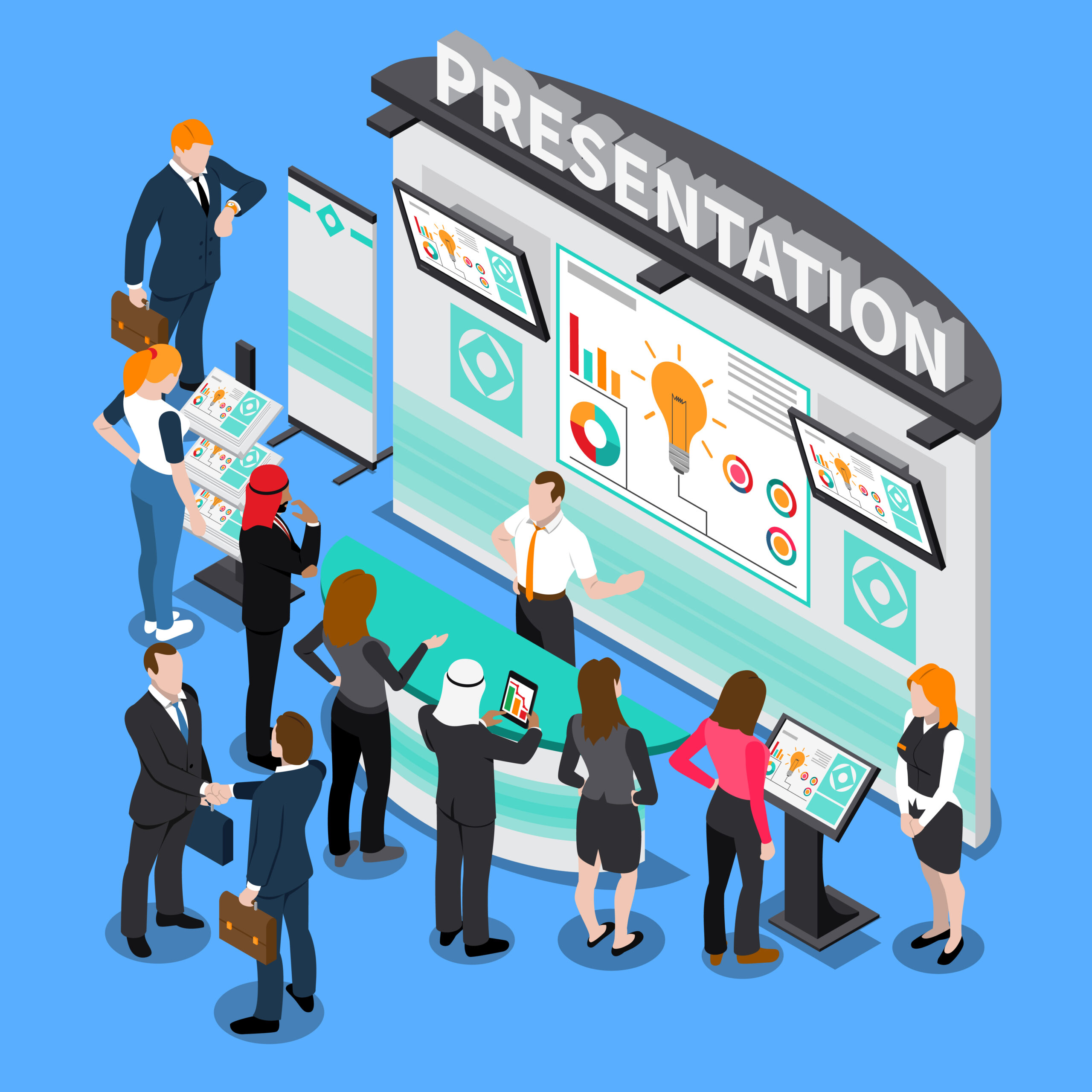
This guide shows you practical ways to transform event data into infographics that grab attention and drive engagement. You’ll learn specific techniques to pick the right data, create clear visuals, and share your content effectively.
Understanding Your Event Data: Finding Stories in Numbers
Before creating infographics, you need to know which parts of your event data will make the strongest visual impact. This starts with smart data selection and organization.
Start by listing all your data sources:
- Attendance numbers and demographics
- Session feedback and ratings
- Survey responses
- Speaker statistics
- Engagement metrics
- Discussion topics and trends
Look for patterns and connections in your data. Which numbers tell interesting stories? What surprising facts emerged from your event? These elements often make the best starting points for infographics.
Focus on quality over quantity. Pick 3-5 strong data points rather than trying to show everything. Too much information can overwhelm viewers and weaken your message. Good infographics make complex ideas simple, not simple ideas complex.
Remember that numbers need context. A 75% satisfaction rate means more when compared to industry standards or previous events. Think about what your audience needs to know to understand why each piece of data matters.
Planning Your Infographic Strategy: Making Your Content Work Harder
A strong infographic starts with good planning. This means matching your data with the right visual format and creating a clear path for your viewers to follow.
First, pick the right type of infographic for your data. Numbers work well in charts and graphs, while processes fit better in flowcharts or timelines. Your choice should make the information easier to grasp, not just prettier to look at.
Some effective matches include:
- Comparison data: Side-by-side charts
- Time-based information: Timelines
- Location data: Maps
- Relationships: Flow diagrams
- Rankings: Lists with visual elements
- Statistics: Simple charts with clear labels
Your brand colors matter too. Use them consistently but sparingly – too many colors can make your infographic hard to read. Pick 2-3 main colors that match your brand and stick to them throughout the piece.
Think about how people will read your infographic. Put the most important information at the top, and create a natural flow from point to point. Each section should lead smoothly into the next, telling a clear story with your data.
Data Visualization Best Practices: Making Numbers Make Sense
Creating clear, useful visuals from data takes more than just picking the right chart type. It’s about making information easy to understand at a glance.
Keep these key points in mind:
- Use consistent scales in your charts
- Label everything clearly
- Add short explanations where needed
- Leave enough white space
- Make text big enough to read easily
Charts should show trends or comparisons quickly. If someone needs more than a few seconds to understand your point, try a different approach. Snapsight can help here by automatically turning complex data into clear idea clouds.
Size matters in data visualization. Make important numbers bigger, and use size differences to show value changes. But keep it reasonable – if one number is twice as big as another, it shouldn’t take up four times the space.
When showing percentages, remember that people understand simple fractions better than decimal points. “Nearly half” often works better than “47.3%.” The goal is quick understanding, not perfect precision.
Tools and Techniques: Getting the Job Done Right
Making infographics doesn’t require a design degree. With the right tools and methods, you can create professional-looking visuals that share your event data effectively.
Start with tools that match your skill level. Many platforms offer ready-made templates you can customize with your data. Some useful options include:
- Basic design platforms with drag-and-drop features
- Data visualization software
- Automated reporting tools
- Template libraries
Templates save time, but they need thoughtful customization. Change colors to match your brand, adjust the text to fit your message, and modify layouts to work with your specific data. Small changes can make standard templates look custom-made.
Smart tools cut down manual work. Snapsight, for example, turns event data into ready-to-use idea clouds automatically. This lets you focus on fine-tuning the message instead of building charts from scratch.
Maximizing Impact Through Distribution: Getting Your Content Seen
Creating great infographics matters only if people see them. A solid distribution plan helps your repurposed content reach the right audiences.
Different platforms need different approaches:
- LinkedIn: Share full infographics with detailed captions
- Twitter: Post bite-sized sections with key stats
- Instagram: Use story-friendly vertical formats
- Email: Include preview images that link to full versions
- Website: Add alt text for search engines
Track how your infographics perform. Watch which formats get the most shares, which data points spark discussion, and which platforms bring the best engagement. Use these insights to improve your next pieces.
Pay attention to timing. Share your infographics when your audience is most active online. For business content, weekday mornings often work best, but test different times to find what works for your specific audience.
Advanced Content Repurposing Tips: Making Your Event Data Work Overtime
Smart content repurposing means getting multiple uses from every piece of data. This stretches your resources and keeps your content fresh longer.
Break big infographics into smaller pieces for social media. A single comprehensive infographic can become:
- Individual stat cards
- Quick-fact posts
- Progress charts
- Quote graphics
- Comparison snapshots
Update your infographics when you get new data. This keeps your content current and gives you reasons to share it again. Yearly comparisons work particularly well, showing progress and trends over time.
Save time by planning ahead. When collecting event data through Snapsight, you can sort out the key points that will make strong visuals later. This makes the content repurposing process smoother and faster.
Transform Event Data into Visual Stories with Snapsight
Snapsight changes how event organizers handle data and content repurposing. The platform works while your event happens, catching insights and preparing them for visual presentation.
Key benefits include:
- Automatic data collection and organization
- Built-in visualization tools
- Identifying essential themes & connected ideas
- Real-time insight generation
- Easy export options for different platforms
The system handles the heavy lifting of data processing, letting you focus on sharing valuable insights with your audience. Whether you need quick social media graphics or detailed report visuals, Snapsight turns raw event data into useful visual content.
Want to make your event data work harder through smart content repurposing? Try Snapsight for free and see how easy it is to turn event insights into engaging infographics. Sign up now to start creating visual content that gets noticed and shared.