How redesigning for clarity helped us understand what we’re actually building.
The hardest part of rebuilding Snapsight wasn’t the code. It wasn’t the design system. It wasn’t even figuring out how to reorganise two years of product features into a coherent story.
The hardest part was admitting that our old website had become a reflection of our internal confusion about what we were building.
Every time we shipped a new feature, we’d add another section to the website. “Cross-session analysis” got a card. “Content generation” got a page. “Multilingual support” got a callout. Each addition made sense in isolation. But together, they created a mess. The website had become a feature catalogue, not a product story.
And when prospects visited, they’d leave confused. Not because the features weren’t valuable, but because they couldn’t figure out what Snapsight actually did. We were showing them twenty different capabilities when what they needed was one clear answer: what is this for?
The rebuild started with that question.
Subtraction before addition
When we brought the team together to plan the redesign, the first instinct was what it always is: What should we add? What new sections do we need? What features should we highlight that we’re not highlighting now?
But one of our engineers said something that changed the direction entirely: “Maybe the problem isn’t what we’re not showing. Maybe it’s that we’re showing too much.”
That became the design principle: subtraction before addition.
Instead of adding more sections, we removed everything that wasn’t essential. Instead of explaining every feature, we focused on three core capabilities that mattered most. Instead of competing for attention with multiple CTAs, we made the path forward obvious.
The new homepage has half the content of the old one. And it’s twice as effective.
What clarity looks like in practice
Here’s a concrete example. On the old site, we had separate pages for “Transcription”, “Translation”, “Insights”, “Reports”, “Content Generation”, and “Analytics”. Each page explained what that feature did. Each page had its own screenshots, use cases, and CTAs.
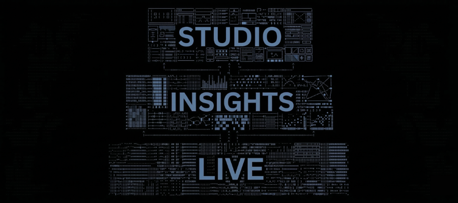
On the new site, we have three sections: Live, Insights, and Studio. That’s it.
Life isn’t about transcription. It’s about the real-time capture of everything that happens during your event, structured and ready to use the moment each session ends.
Insights isn’t about reports. It’s about intelligence and cross-session analysis that tells you what actually happened across your entire event, not just within individual sessions.
Studio isn’t about content generation. It’s about transformation, turning event intelligence into assets you can publish, share, and use for months.
Three capabilities. One coherent system. Instead of asking prospects to understand six different features and figure out how they connect, we show them one platform with three clear layers.
That’s what clarity looks like. Not simplification. Coherence.
Why dark mode matters (and it’s not about aesthetics)
People ask why we chose a dark interface when most SaaS platforms use light backgrounds. The answer isn’t about looking different. It’s about functional clarity.
When you have a dark background, everything else stands out. The text is sharper. Actions are obvious. Your eye knows exactly where to look. There’s no ambiguity about what matters.
That’s what Snapsight does for event content. It takes chaos, 40 sessions, hundreds of speakers, and thousands of insights and makes it clear. The design mirrors the function.
The green accent colour (#A1FF9A) serves the same purpose. It’s not decorative. It highlights what matters: the actions you should take, the insights you should notice, and the outcomes you should care about.
High contrast isn’t a style choice. It’s a clear choice. And when your product’s job is to create clarity, your design should demonstrate it, not just describe it.
Showing instead of telling
The biggest structural change we made was moving from explanation to demonstration.
On the old site, we’d say things like “Snapsight generates cross-session intelligence reports.” On the new site, we show you what those reports look like. Real examples from real events. Not mockups. Not hypotheticals. Actual outputs customers use to brief their leadership teams.
We show the executive summary that a conference organiser sent to their board. We show the content library, a marketing team-generated collection from a three-day event. We show the trend analysis that shaped an organisation’s annual planning.
When you see what the platform produces, you immediately understand what it’s for. You don’t have to imagine it. You don’t have to translate marketing language into practical outcomes. You see it.
That shift, from telling people what we do to showing them what becomes possible, made the product instantly understandable in a way the old site never achieved.
What the website taught us about the product
Here’s the unexpected outcome: rebuilding the website made us better at building the product.
When you’re forced to explain what you do in the simplest possible terms, you discover where your thinking is still fuzzy. If you can’t articulate why a feature matters in one sentence, maybe it’s because the feature itself isn’t coherent yet.
The process of redesigning the site revealed gaps in our product narrative that we hadn’t noticed. Why did Insights and Studio feel like separate tools instead of connected capabilities? Because we’d built them separately and never integrated the experience. The website exposed that. And we fixed it.
Now, when you generate content in Studio, it’s built directly from the intelligence insights extracted. They’re not separate features. They’re connected layers of one system. The website forced product clarity.
What changed for customers
If you’re a current Snapsight customer, you’ll notice the new site finally reflects what you’ve been experiencing all along. The disconnect between what we said we did and what you actually used us for is gone.
For new prospects, the experience is completely different. Instead of landing on a feature list and trying to piece together what the platform does, you immediately see: this is the event content intelligence platform. This is what it captures (Live), what it analyses (Insights), and what it creates (Studio). This is what becomes possible.
That alignment matters. When the marketing matches the product, trust builds instantly. You’re not promised one thing and delivered another. What you see is what you get.
What’s next
The rebuild isn’t the end; it’s the foundation for what comes next.
We’re continuing to improve how Live, Insights, and Studio work together. We’re adding more customisation options for reports, more content formats in Studio, and more integrations that push intelligence directly into the tools you already use.
But we’re doing it with a clarity principle: every new feature has to fit the narrative. If we can’t explain how it extends one of the three core capabilities, we don’t ship it.
That discipline, choosing coherence over feature breadth, is what the rebuild taught us. And it’s what will keep Snapsight clear as we continue to evolve.
Explore the new Snapsight at snapsight.com. And if you’re building products where clarity matters, take the time to rebuild your story. It’s worth it.